Components are like lego bricks. You can reuse them in your designs. Example components are buttons, cards, and modals. All of your components live inside a Design System and are managed together in a single, unified editor. You chat with the Design System as a whole to add, edit, and refine one or many components at a time, then publish a new version of the Design System when you’re ready.Documentation Index
Fetch the complete documentation index at: https://magicpatterns.mintlify.dev/docs/llms.txt
Use this file to discover all available pages before exploring further.
Creating a New Component
Components live inside Design Systems. To create a new component, you simply ask the agent for it from the Design System chat.Open your Design System
From the dashboard, navigate to Design Systems and open the Design
System where you want to add the component.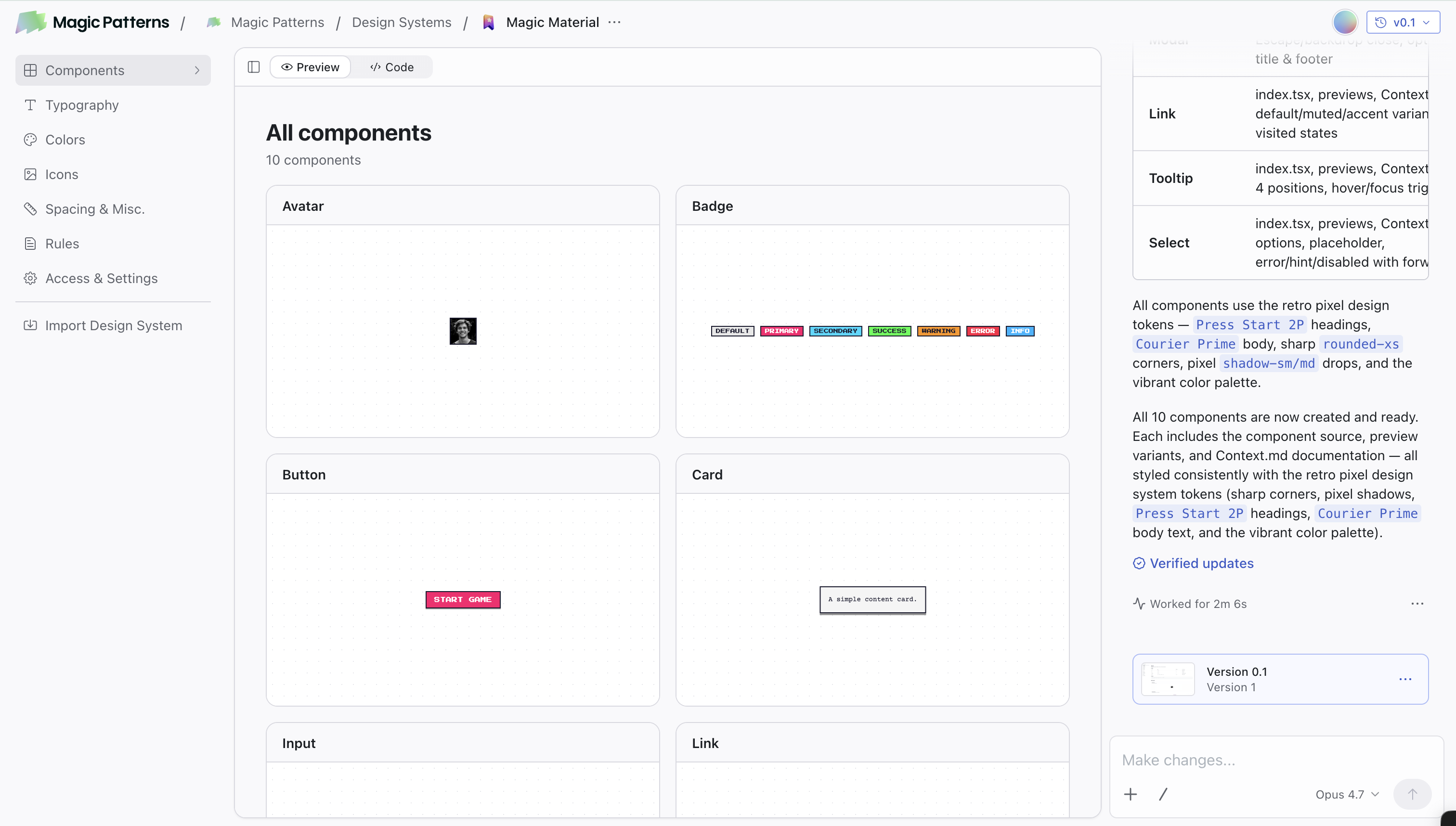
Go to the Components page
Inside your Design System, open the Components page. It shows the component list on the left, the selected component’s preview/code in the middle, and the unified chat on the right.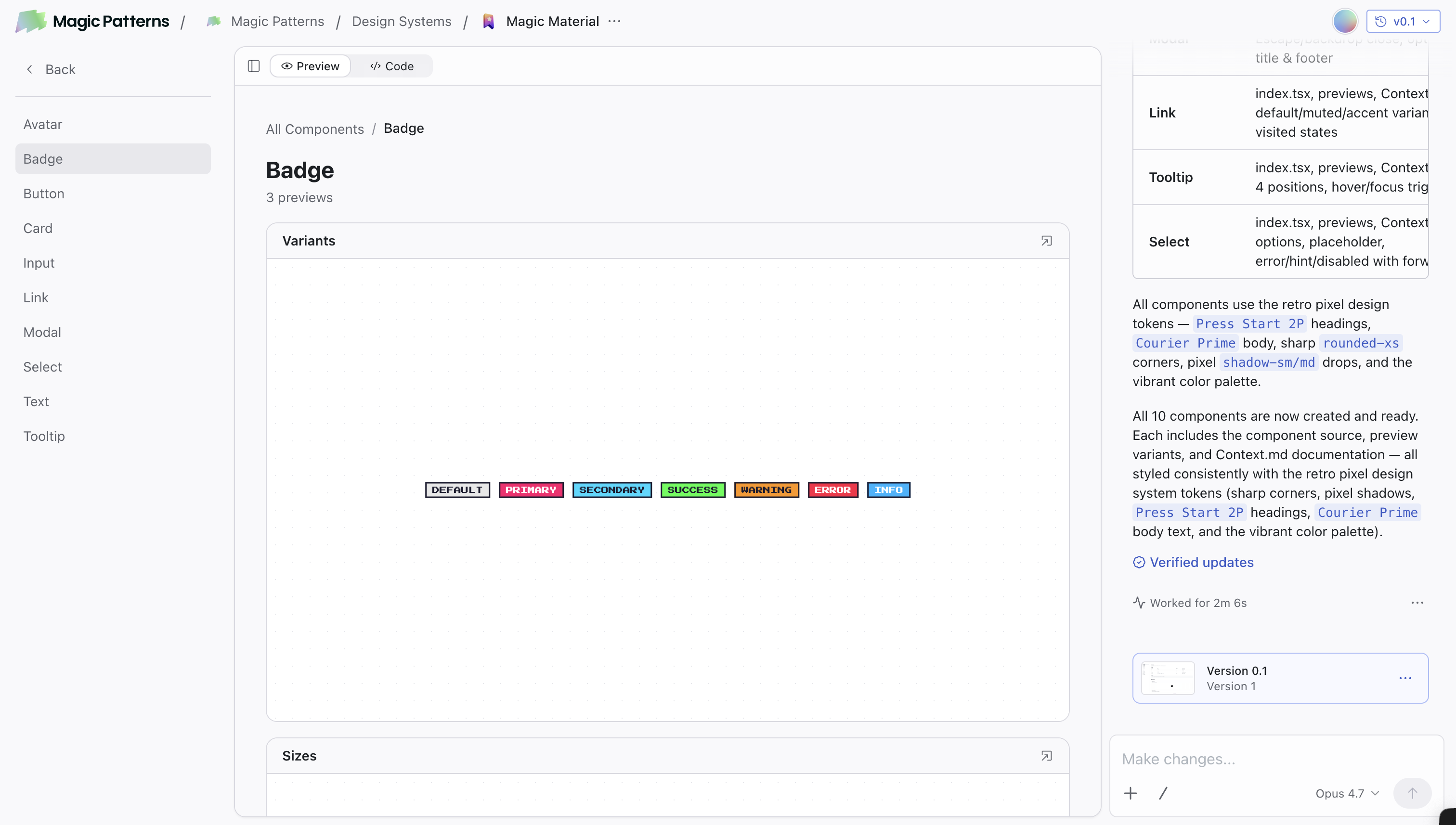
Ask the agent to create your component
In the chat, describe the component you want. You can attach a screenshot, paste a Figma frame, or describe it in plain English.The agent creates the component, adds it to your Design System, and shows it in the preview. You can keep iterating in the same chat that edits every other part of your Design System.
Editing Components
Everything inside a Design System (components, typography, colors, icons, spacing, rules) is edited from a single chat that lives with the Design System. The chat is available on every tab in the Design System and operates on the whole Design System, not just the tab you’re on. You can:- Edit one component: tag it with
@or refer to it by name. “Make@Buttonrounder and add a destructive variant.” - Edit several at once: “Update
@Card,@Modal, and@Toastto use a 12px border radius.” - Make universal updates: “Tighten the spacing scale across the whole system” or “switch the primary color to indigo and update every component that uses it.”
- Update typography or colors from any tab: ask in the chat and the agent updates the relevant tokens and the components that depend on them.
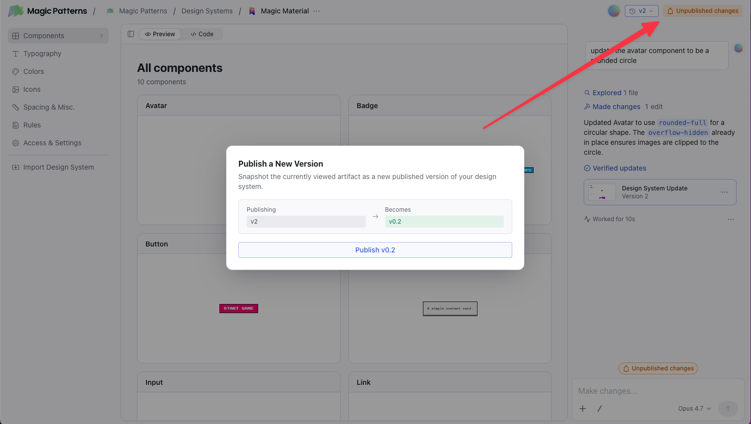
Versioning & Publishing
Versions are tracked at the Design System level. The version selector in the top-right of the editor shows your current version (e.g.v1.2), and you can revert to a prior version from the same dropdown.
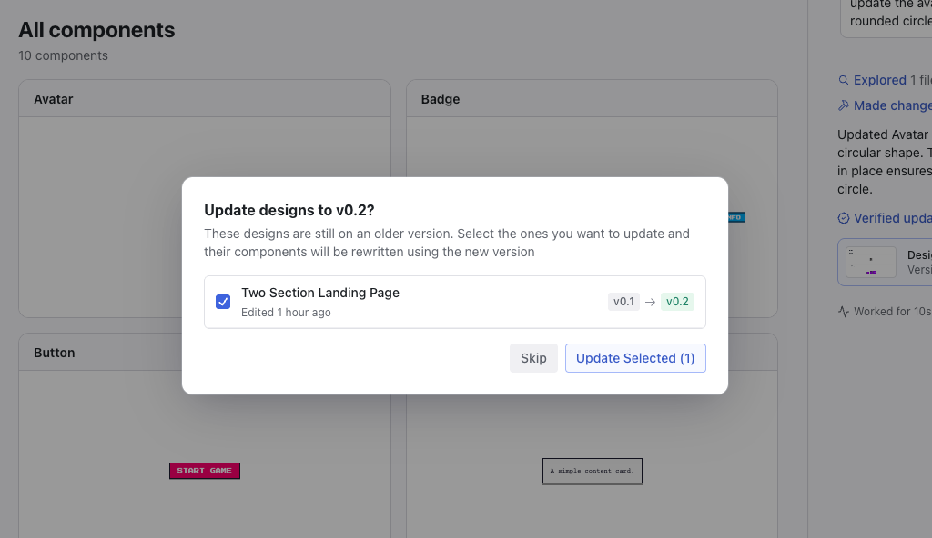
When you publish a new version of your Design System, a modal appears letting you choose which existing designs to upgrade to that version. This lets you roll out a batch of changes (across many components, tokens, or rules) to all your designs in one step.
Using Components
There are two ways to use components from your Design System in designs:Automatic Usage with Design Systems
When you create a Design System and add components to it, the AI will automatically use those components when generating designs. You don’t need to manually reference them. Just select your Design System when creating a new design.Learn about Design Systems
Set up a Design System with your components for automatic usage across all
designs.
Manual Reference with @
You can also explicitly reference components in your prompts using the@ symbol. This is useful when you want to use a specific component or reference components from outside your current Design System.
How it works:
- Start typing
@in the chat - A component selector appears
- Select the component you want
- The component is added to your prompt
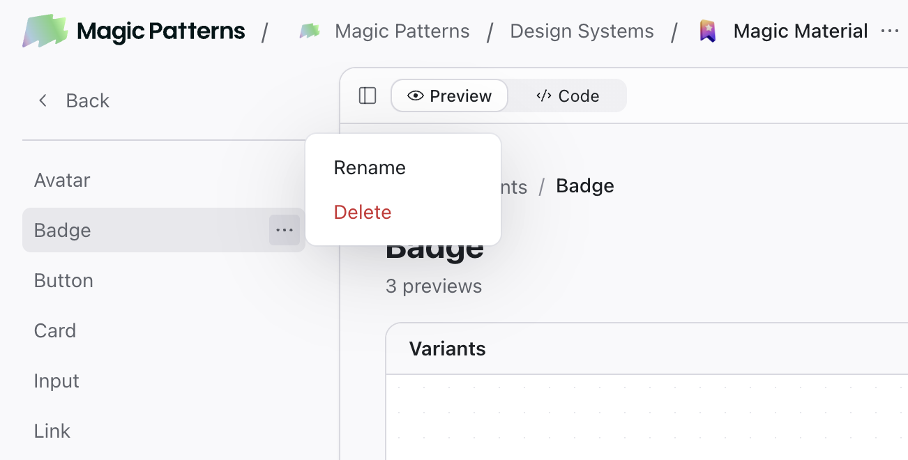
Deleting Components
You can also deprecate a component instead of deleting it, which means the AI will no longer use it in new designs.- Open your Design System and find the component
- Click the three dots next to the component name and select Delete
- Confirm the deletion